Interests
Sometimes, I draw illustrations for fun.
Interests
Sometimes, I draw illustrations for fun.
2014
Baidu LifeNote
For Young Age
LifeNote
A Mobile Tool for Young People Record Their daily Life Better

Baidu Input Method is a tool helps users including white-collars, students to type words, send emoticons, record voice, to express what they think and feel. It is a Chinese popular mobile APP, ranking Top 3, with over 600 million users and over 100 million DAU in 2015.
It has grown very big over the 7-year lifespan at that time, so the original design seems outdated and cumbersome. If we add more features into it with the orginal structure, the user experience will be horrible.
In 2015, I led a interative redesign of Baidu Input method to solve its problem and tried to give it long vitality.
My Role
Only UX Design
Half Product Manager
Type
Product Design
2014

More Features, Harder to Find the Needed One
More Features, Less Extensibilities
Cumbersome
Find Balance & Value
Input Method is a highly user habits related product. Can we avoid risk of annoying users with new designs?
How to Balance User Habits and Experience?
What Specific Value can Redesign Bring?

I used half a year to make a big and uncertain design project smaller and focused, finally worked out design solutions and validated it. I led my small team with other 2 interaction designers to conduct the user survey, data analysis, competitive analysis. Then I transfered the research insghts to specific design objectives and principles. We three interaciton designers owned 3 topics, and I directed the whole project.

Where to start and which part is the most urgent to upadate? I need to figure it out and report the importance to the product team. So I started from a series of design research. Here are the ways.
Survey about Users'Knowledge
100+ Answers
from Company in 3 Days
Competitive Analysis
Data Review
-
What’s the Logo Menu’s structure?
-
What’s Every input panels structure?
-
Important & new features review?
I made a survey about features, structures, guidance with another user researcher. It’s hard to get enough questionnaires in a short time if distribute it to public website. So I decided to disrtibute it to some Baidu staffs through company’s chatting tool Hi and related email. At last, we got over 100 pieces valid answers.
Main Findings
1. Users have needs of setting input method. But a lot of settings are in-discoverable, whicn result in low click data. It’s mainly caused by the information architecture and structure design of Tool Bar and Logo Menu.
2. A lot of features are hard to understand. Even some are similar to confuse users.
3. Typing experience with Baidu Input Method in different platform is different. It’s not smooth to transfer to another system in typing.
4. Swith in and out of some keyboard panels is different which result in some failures.
5. Different users have different habits, especially of typing tool. They have the potential need to customize their keyboard.

Update structure of Logo Menu and Tool Bar
Optimize structure of Input Panels and Feature Panels smartly
Redesign different guide screens of features
-
Increase necessary usage of different settings
-
Fulfill people’s requirement of personality
-
Consider future extensibility
-
Make core experience in Android & iOS consistent to ensure people have similar experiences when they change a phone to the other system
-
Make feature panels simple as much as possible
-
Avoid using introductory pages when it is unnecessary
-
Ensure people understand new features quickly with introductory pages by making them effcient with specific meanings
I’ll show you design details from “Update structure of Logo Menu and Tool Bar”.
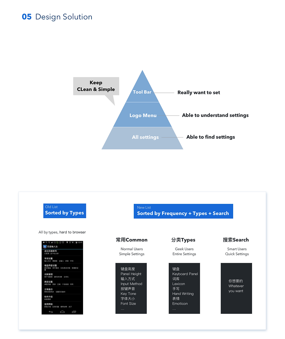
I strarted from thinking of the relationship of Tool Bar, Logo Menu and Settings List, which are all about input settings. In the old version, Tool Bar, Menu and Settings are independent but also partically overlapped. I gave a new clear definition of relationship of the three parts, which is like a triangle.
I redesigned the information architecture of All Settings. In order to let users able to find settings, I sorted the settings to three parts, by thinking of types of users and types of settings.
Design IA of All Settings
Drafts of Logo Menu & Tool Bar
I drafted several designs of Logo Menu & Tool Bar. Then I evaluated them and found that every design can solve part of the problems I mentioned before, but also made some new problems like change too much or not directly.

But the good part was I found the design direction by sharing the drafts with PMs and communicating my design thoughts. They preferred users can diy the tool bar easily and learnt the menu as simple as possible. I also found a mistake I made, which was thinking too logically and focused on sorting the settings. Then I optimized my design solution again and worked it out.
Reduce Hierarchy of Menu and Let it Flow

-
Users can’t know what features or settings are in each Menu Tab.
-
Tool Bar and Logo Menu are independent.
-
Features in Tool Bar may not be used frequently.
-
Future features may be added to the 3rd screen which need a lot of swipes.
Design Content of Logo Menu
From 26 to 18 items

Wireframes

User Dynamic Prototype shows more details & test users

-
Thought every motion in the process
-
Chose a proper tool pixate to make sure every motion can be operated
-
Recorded the vedio of dynamic prototype to show to PMs & RDs
-
Organized users test with the prototype